Make Menus Work
By Bonnie Friedman
Back in the day (late '80s/early '90s), I taught menu merchandising to Maui Community College culinary arts students. Many things have changed. Today, every restaurant - right down to the humblest plate lunch joint - has sophisticated technology in-house or access to it. Menus can be altered constantly and printed out for pennies. The power of a menu is still potent, though, and restaurateurs should make the most of it.
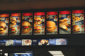 |
| An easy example of a successful one is McDonald's menu, which incorporates colorful food photos, the color red and easy-to-read fonts. |
I always began the first class by asking, "What is a menu?" And after the obvious and smart-alecky answers, we got down to business. It's an ad, a marketing tool, a way to communicate with customers and often the way they form their first impression of your operation. How many times have you seen people look at a menu, get up and walk out? In the best cases, a menu is a work of art. Clearly, there are going to be big differences between fast food menus and fine dining menus, but the principles are identical.
A menu can and should be a restaurant's bestseller, a workhorse. There's a psychology to the way it should be laid out, the color of the paper and the ink, the font (ah, fonts!), the verbiage, even the size and number of pages - most people don’t want to read a book when they're hungry or enjoying the company of family and friends. That goes for wine lists, too.
Some of this is a matter of personal taste - and remember, everyone who thinks he has good taste can't possibly have good taste - but there are tried and true methods. If you don't believe it, take a good look at the menus and other collateral material at the most successful and ubiquitous chains on the planet. Every one of them, for instance, uses the color red, which stimulates the appetite. Take a walk up and down the aisles of your favorite market and notice how many packages incorporate red. There's a reason Ritz Crackers and Coca-Cola haven't changed their colors ... ever. The chains also use full-color photos, which may not be economical or practical for everyone but a picture is worth a thousand words, right? And they all use clear, dark type in a simple font that is big enough for "more mature" eyes to read, even at a distance, even in dimly lit rooms. The use of unreadable fonts drives me nuts. How is it possible that when chefs first got their hands on fonts, so many of them managed to choose the most unreadable ones they could find for their menus? Better to have a graphic designer design it. And a writer write it. Then you can stick to cooking, OK?
Order and placement matter. In every category, the No. 1 position usually sells the most. It just does. Entrees should be presented most prominently. They're your biggest ticket items. Set apart specials, signature items, award-winners - in a box, use a different color ink, bigger and/or bolder type, add a photo. You'll sell more of them. It’s just the way human nature works. Best place to do this? Smack dab in the middle of the page (the right-hand page if your menu opens like a book). It's where our eyes go first. They just do. Here's a tip. A separate dessert menu is better than having a server ask if anyone would like dessert. It's easy to say "no," more difficult to resist a well-written description of delectable sweets. Same goes for cocktail menus.
OK. Verbiage. Clever names for dishes and menu categories are fun as long as they really are clever, and not confusing or worse, silly. And yes, describing a dish in creative language can make it irresistible. But believe me when I tell you, no one - no one - cares if the sauce is finished with 1.5 ounces of European-style, lightly salted butter and a pinch of tarragon picked at 6:45 this morning on a small upcountry farm. People with allergies and other dietary restrictions will let you know, hopefully well in advance. Just tempt us concisely. Please.
Another pet peeve - if someone asks for a copy of your menu, give it up. Or have an inexpensive, mini-version available. It's not a state secret. No one wants to try to recreate all your dishes and open a place down the street. People collect them, especially when they've had a great meal. We like to brag to our foodie friends.
Now, chef, step away from the fonts. And let us help you make that menu work.
Bonnie Friedman has owned and operated Grapevine Productions, a public relations company on Maui, for 20 years. She is a well-published and well-traveled freelance writer and amateur photographer and, most important to her friends, a certified pastry cook. She recently started Tour da Food Maui, customized ethnic food tours.